>>109219
Hi.
>Not sure about the order of these.
After some thought, I've determined that either way is good, and depends of who you want to focus on. I wrote some examples below of how I imagine the sequences.
Ice cream girl fist
[First panel]
Ice cream girl: Oh shit- WATCH OUT!
[Second panel]
Pear girl: Do you think they're getting too large for their own good?
Orange girl: Hmmm... Nah. Just look at ourselves, we're fine. What's the worst that could happen?
[Third panel]
>Orange girl fucking dies
Pear girl: WHAT THE FUCK!?
Ice cream girl (in a tiny square): I'M SORRY! (or "OH GOD I JUST KILLED SOMEONE")
Fruit girls first
[First panel]
>There's a "Meanwhile..." written on one of the corners
Pear girl: We can see that our dear Vale is fighting for her life, or is it her belt's buckle that is fighting?
Orange girl: Hey, don't make fun of hard workers (jokingly)
Pear girl: This is probably the hardest she's ever worked for in her entire life, you know?
[Second panel]
Ice cream girl (only the bubble): oh shit- WATCH OUT!
Orange girl: Hm? Did you hear her say something?
Pear girl: It sounded like "Hog out"
Orange girl: Hog out? Is she talking about us? because the only ones hogging out in this place are these two-
[Third panel]
>Orange girl fucking dies
Pear girl: OH SHIT!
Ice cream girl (in a tiny square): I'M SORRY!
>but it is a fetish comic and it might distract?
The head exploding is funny as shit. No one said that you shouldn't have comedy in a fetish comic.
I think pear girl's eyes should be smaller for a more shocked look.
Also, the belt buckle looks like it's not traveling as fast as implied in the panel. You should blur and bend it in such a way that makes it look like it's traveling extremely fast.
>>109220
Could you give me an example of how it'd look?
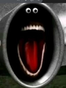
Also, this is unrelated, but pear girl's face looks like this and it made me laugh my ass off (see image attached).